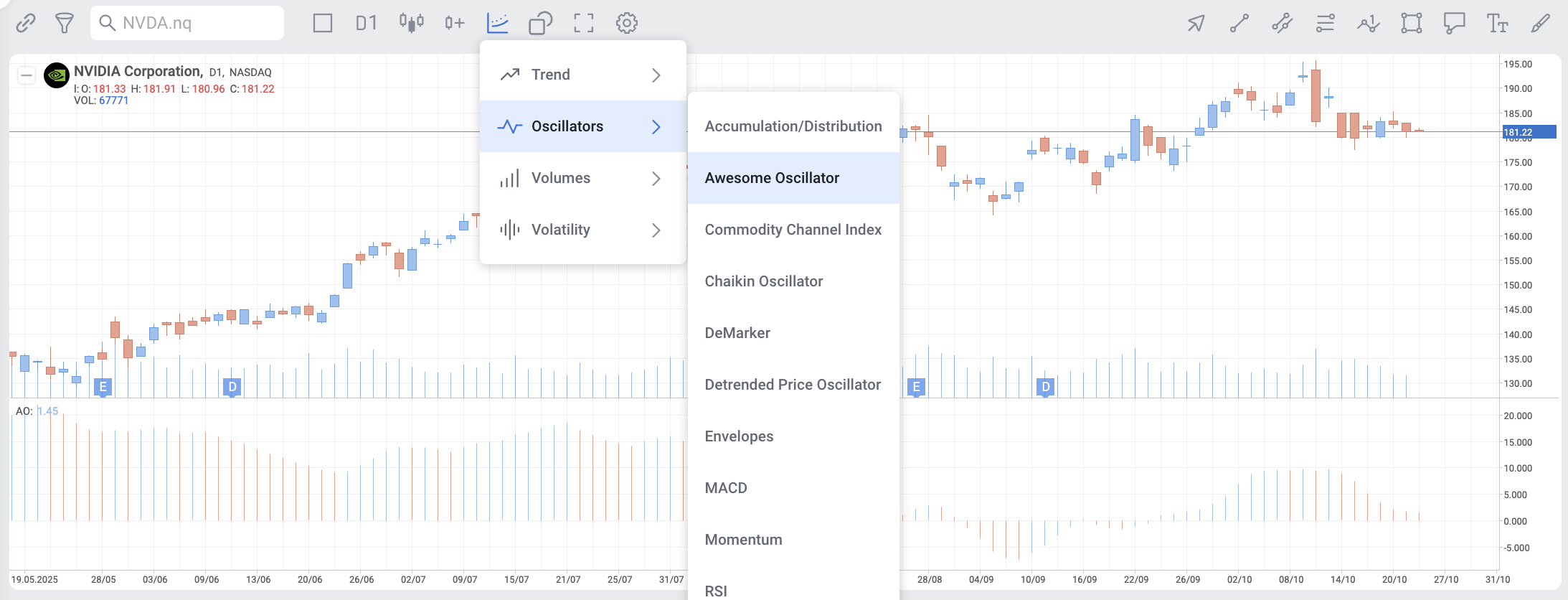
Overview
The Awesome Oscillator (AO) is one of the most popular indicators that are used to measure momentum in the stock and commodity markets.
It was developed by Bill Williams, a famous charting enthusiast and technical analyst who approached the markets on a psychological level.
In this article, we will detail the calculations used to compile the Awesome Oscillator to then move on to applying the indicator in practice.
We are also going to look at how the AO is different from other oscillators, as well as key trading strategies involving the indicator.

Description
By its simplest definition, the Awesome Oscillator (AO) is a market momentum indicator that compares recent market movements to past market movements to gauge whether bullish or bearish forces are currently driving the market.
Similar to the Moving Average Convergence Divergence (MACD) indicator, the AO indicator histogram displays the market momentum of a recent number of periods compared to the momentum of a larger number of previous periods.
This indicator uses a zero line in the centre, either side of which price movements are plotted according to a comparison of two different moving averages.
How it is calculated
The AO histogram is a 34-period simple moving average that is plotted through the midpoints of the bars (H+L)/2, and subtracted from the 5-period simple moving average, graphed across the midpoints of the bars (H+L)/2.
Awesome Oscillator = SMA (MEDIAN PRICE, 5 PERIODS) – SMA (MEDIAN PRICE, 34 PERIODS)
Where:
Median Price = (H+L)/2,
SMA = Simple Moving Average
H = The highest price of the bars
L = The lowest price of the bars
In most of the graphs, momentum is classified and indicated in respect of the color of the bars.
Green bars indicate that momentum is higher than the previous, showing upward momentum, while red bars indicate that it’s lower than the previous, showing downward momentum.
To find out more about this indicator and it`s trading signals click here.
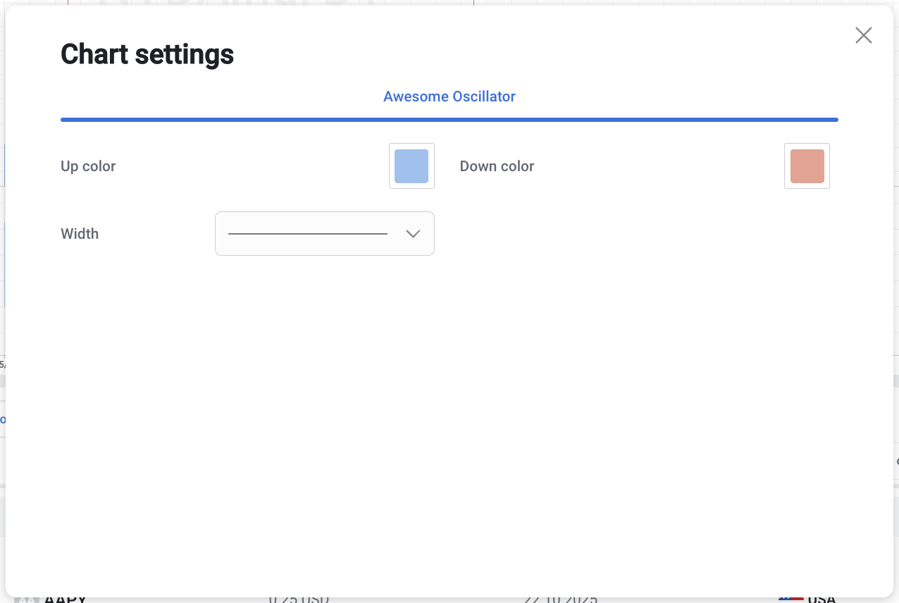
Settings in the chart

